Conversion and Extras
Obviously the options here are endless so I’ll just cover what I’m up to.
I have added head plumes (still a WIP), chainswords, pistol pouches, an ammo crate and bed roll. As well as making my own lances (as mentioned in a previous post), taking off the reins, chaos markings & spikes, and green-stuffing the horses and helmets.
Here is where I am up to:
I have also started a commander model. Will I call him Col. Ackland? I'll see how he turns out.
Colour scheme
Now we are getting somewhere. This is probably the most important decision regarding the look and feel of the cavalry.
If you have a red coated praetorian Amy it may be an easy choice to keep them red so they match. But historically cavalry are commonly stand out from the ‘regulars’ with fancy uniforms. Gravis has opted for the historical path and used blue jackets and pants trimmed with white.
My inspiration has come from the blues and royal house hold cavalry.
and here is my first touches of colour to the model to see if it works:
The dragoon and grenadier:
Basically I don’t think there are enough top knots and mohawks in 40k (smirk).
IMHO, If using a historical reference there is one vital key to making it work in 40k, and that is to capture the style and vibe of the historical reference without straight out replicating it. Look at space marines for example, ultramaries use the roman centurion style, blood angels use Italian Baroque-Christian style, and space wolves Celtic Viking warrior style. Tyranids and Necrons draw their style from respective si fi movies and the examples could go on forever. The point is in these examples they are not recreating the historical reference but just borrowing the feel and style elements and incorporating it into the grim dark 40k universe. Easy to say, hard to do, but something I try and to think about.
now that being said. some Death Korps rocked up at work desk today and when I got home I did this..... I'm sure some people will kill me, but I think its kinda funny.
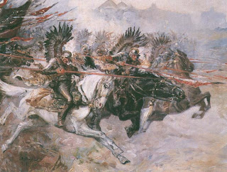
To finish up, here are some other historical references to get the creative juices flowing.


Looking sharp! I like where you're going with the color scheme. Can't wait to see more!
ReplyDeleteThanks! This is proving to be a fun project. :)
ReplyDelete